TL;DR
The short version
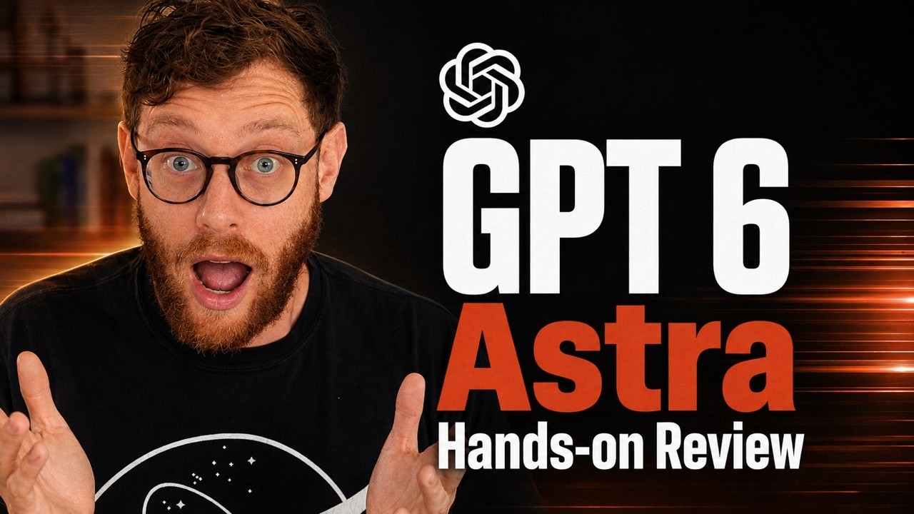
Every's 30-person team tested OpenAI's GPT-6 Astra against Anthropic's Fable and kept a surprising verdict: Astra makes the prettier thing, but for the hardest work they still reach for Fable.
The reason, per their day-one vibe check: Astra adds bells and whistles where Fable grasps the sense of a prompt and keeps it simple. That gap — design taste versus product taste — is the one worth watching.
Built on Every's 3 Sep 2026 Astra vibe check. Task-time figures are the team's day-one demo anecdotes, not independently verified.
The prettier model didn't win
On day one, Every's team ran Astra through writing, coding, and design. The strengths are real: crisp writing with no AI-isms, standout computer use — it spent five hours in Premiere cutting the team's last review video, mostly hands-free — and excellent 3D work, including an explorable, historically-sourced reconstruction of Waterloo built in a few hours.
It's even honest about itself. Asked to write its own vibe check, it obliged:
GPT-6 Astra is a showhorse. OpenAI's new model has striking visual taste and a knack for consulting work. Its ambition still outruns its judgment.
Astra's self-written vibe check, via Every
Then the verdict turns. For top-end, long-running, big-delegation work, the reviewer still reaches for Fable. Not because Astra is worse-looking — because Astra is more, and more is often wrong.
What "extra" costs
The team's word for Astra is "extra." Push it harder and it piles on labels, buttons, and stray copy. Ask for a login page and it invents a "private case study," an "enter shared password to continue," a mismatched sign-in link — bells and whistles nobody asked for.
Fable's first take is plainer and more refined. That's the point. The harder you push Astra's effort level, the more it elaborates instead of doing the right amount. Restraint is the missing skill.
This is easy to misread as a polish problem. It isn't. Astra has real design taste — the interfaces look good. What it lacks is the judgment to stop.
The tell: one app, two builds
Every's editor asked both models to build an app to digitize his handwritten journals.
Fable's build: show a page, press one button, it transcribes, move to the next. Continuous. Shaped around the actual job. Astra's build: warmer paper, green highlights, more considered visuals — and it forces you to do one page at a time, click through, save, repeat. More designed. Less usable.
Why this matters past one model review
The instinct — yours, and increasingly the model's — is to reward the output that looks more complete. More sections, more controls, more considered visuals read as more effort, so they read as better.
For real product work that instinct is backwards. The thing that grasps the sense of a request and extends it simply beats the thing that decorates it. When you evaluate models — or your own work — the question isn't "which looks like more was done?" It's "which one understood what I actually needed and stopped there?"
Two practical notes. If a model gets "extra" at high effort, a lighter setting sometimes gives the cleaner result — more reasoning isn't always more restraint. And judge on your real use case, not a demo: a prettier welcome screen tells you little; watching the tool fit an actual workflow tells you everything.
One honest caveat: this is a day-one vibe check from a team that sells AI tooling, so read the enthusiasm accordingly. But they still rank a competitor's model higher for the hardest work — the opposite of a promotional conclusion, and the part most worth trusting.