TL;DR
The short version
Meta's Muse feels easy because its designers treated the agent as someone you message, not a tool you drive. One ongoing chat, a visible status that answers "is it working?" first, and layers of detail that only engineers ever open.
On How I AI, Alex Cornell, who leads design on Muse, explains the one question behind almost every decision: how would you handle this if you were talking to another person? That gave Muse messaging patterns, a single main chat, layered status, generative UI inside fixed building blocks, and demos that re-render data people already own.
Built on Claire Vo's interview with Alex Cornell (12 October 2026). Launch date checked against Meta's launch post; progressive-disclosure guidance from Jakob Nielsen at NN/g; usage examples are Cornell's own account.
The frame: how would a person handle this?
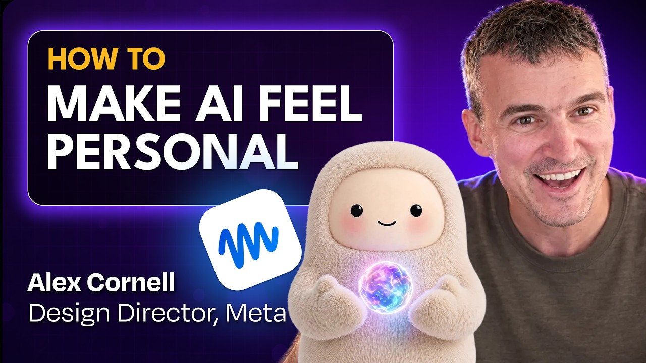
Alex Cornell leads design on Muse, the personal agent Meta launched on 8 September. On How I AI, host Claire Vo calls it the "fastest time to pure delight" she has had with an AI product in a long time.
Most AI apps took their patterns from earlier AI apps. Muse took them from messaging. Because the agent can message you on its own and work in the background, the team brought back chat bubbles, so you can tell where messages that arrive hours apart begin and end. They added reactions to acknowledge a request, and put an embodied character at the top of the screen.
It was more like how would you handle this if you were actually speaking with another person, you know, and that was immensely clarifying, I think, in almost every decision that we had to make.
Alex Cornell on How I AI
The same frame settles the thread question. Muse has one main chat and optional side chats, not a new thread every time. Models can now hold that much context, and it matches how you talk to one entity. "I don't side thread with my mom," Cornell says. He admits the line between main and side chats is still unclear to normal users.
Status is the trust surface
Background work raises one question above all: is it doing anything? Muse answers it in layers. The top line says your Muse is working. The next tells you what, with an emoji: "researching pumpkin patches." Tap it and you get the list of everything it has done. Keep tapping and you reach the actual calls and code, which matters for auditing.
That is progressive disclosure: show the essentials first and defer the rest. As Cornell puts it, an engineer may want the full trace, "but if you're a normal person you maybe just want to know like is it doing something." So the chain of thought stays out of the main chat.
Vo adds a sharper point. On-screen reasoning is often "a band-aid for latency." Muse's answer is speed, plus acknowledgement. Ask for something hard and it reacts or replies with a plan before it goes off to work, the way a person would. "They're not going to just ghost you until they're done."
One caution: the Nielsen Norman Group warns that designs with more than two disclosure levels "typically have low usability." Muse's stack is deeper than that. It works if most people never go past the first line.
Generative UI, on the rails
"Generative UI" often means a screen that is different every time. Muse's version is more modest. The building blocks stay fixed: avatar, status, Ideas, Feed. What's generated lives inside them. Ideas are based on what you've talked about. The status picks its own emoji. Turn your avatar into a tomato and you get a tomato typing on a laptop.
The extra surfaces are there to show capability. You could run Muse on chat alone, Cornell says, but "there's so much that it can do that might not be intuitive." Ideas tells you what you didn't know to ask for. Talk about golf all day, as he does, and you get golf ideas.
The best use cases re-render what you already have
Cornell's demos share one pattern: data people already own but never look at, turned into something they enjoy.
- Instagram saves → a daily SkyMall catalog. Muse sorted his saves into folders, suggested gifts, then rendered them in the style of the 90s in-flight magazine. A weekly trigger checks his wish list for sales.
- Golf data → round recaps. Scores and shot-by-shot watch data become charts showing how an 84 could have been a 79, plus practice breakdowns tied to his single-digit-handicap goal.
- A 20-year-old blog → a morning podcast. Muse found the posts through the Wayback Machine and reads a random one to him each day.
- chess.com games → a dashboard with a coach that got snarky without being told to.
"Muse is able to take it and just like reform it into a way that's like really interesting and useful for me," he says.
Design the system, not the screen
For designers, the shift is non-determinism. A shipped screen used to look the same for every customer. Now every Muse setup is different, so you design "the underlying foundation and the system… the scaffolding," not one perfect layout.
Cornell admits he had to switch off part of his design brain when looking at what the agent makes. The colours may be off, but it is "very useful output for me… it's good, it's fine."
Worth weighing: Cornell designed the product and Vo calls herself a fan, so the episode includes no pushback on privacy, failures or cost. Critics quoted by Fortune call cute agent mascots "entirely marketing."